Are you searching for a reliable responsive web design company in Hyderabad to completely transform your online presence? The way consumers browse the internet has changed forever. Walk down any busy street in Dilsukhnagar, grab a coffee in Madhapur, or wait at a bus stop in Kothapet, and you will witness the exact same behavior: everyone is glued to their smartphones. They are actively searching for local services, booking corporate appointments, and buying products on the go. If your business website looks broken, distorted, or microscopically tiny on their screens, you have already lost them to your competition.
In the past, web developers had to build two completely separate versions of a website: one exclusively for desktop computers and another just for mobile phones. This outdated method was incredibly expensive, frustrating to manage, and terrible for search engine optimization. Today, we have a vastly superior solution. As a premier digital agency, Digital Natives is here to tell you that responsive design is no longer just a passing digital trend it is a mandatory, absolute requirement for any business in Telangana that wants to survive and thrive online.
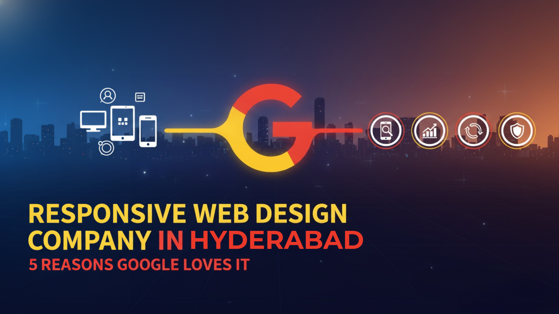
At our headquarters in LB Nagar, we frequently meet with frustrated business owners who ask why their beautiful desktop site is nowhere to be found on Google’s first page. The answer is almost always a glaring lack of mobile optimization. If you want to rank higher, hiring a dedicated responsive web design company in Hyderabad is the ultimate key. In this comprehensive guide, we will dive into what responsive design actually is, why the world’s largest search engine rigorously rewards it, and how it can completely transform your local business.
1. What Exactly Is Responsive Web Design?
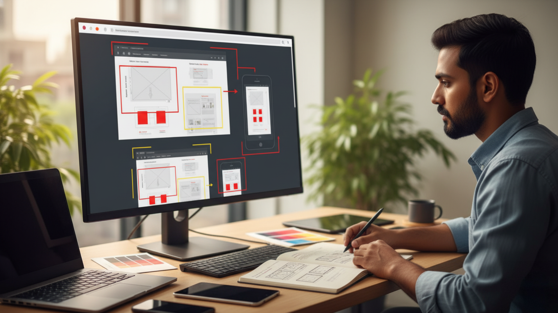
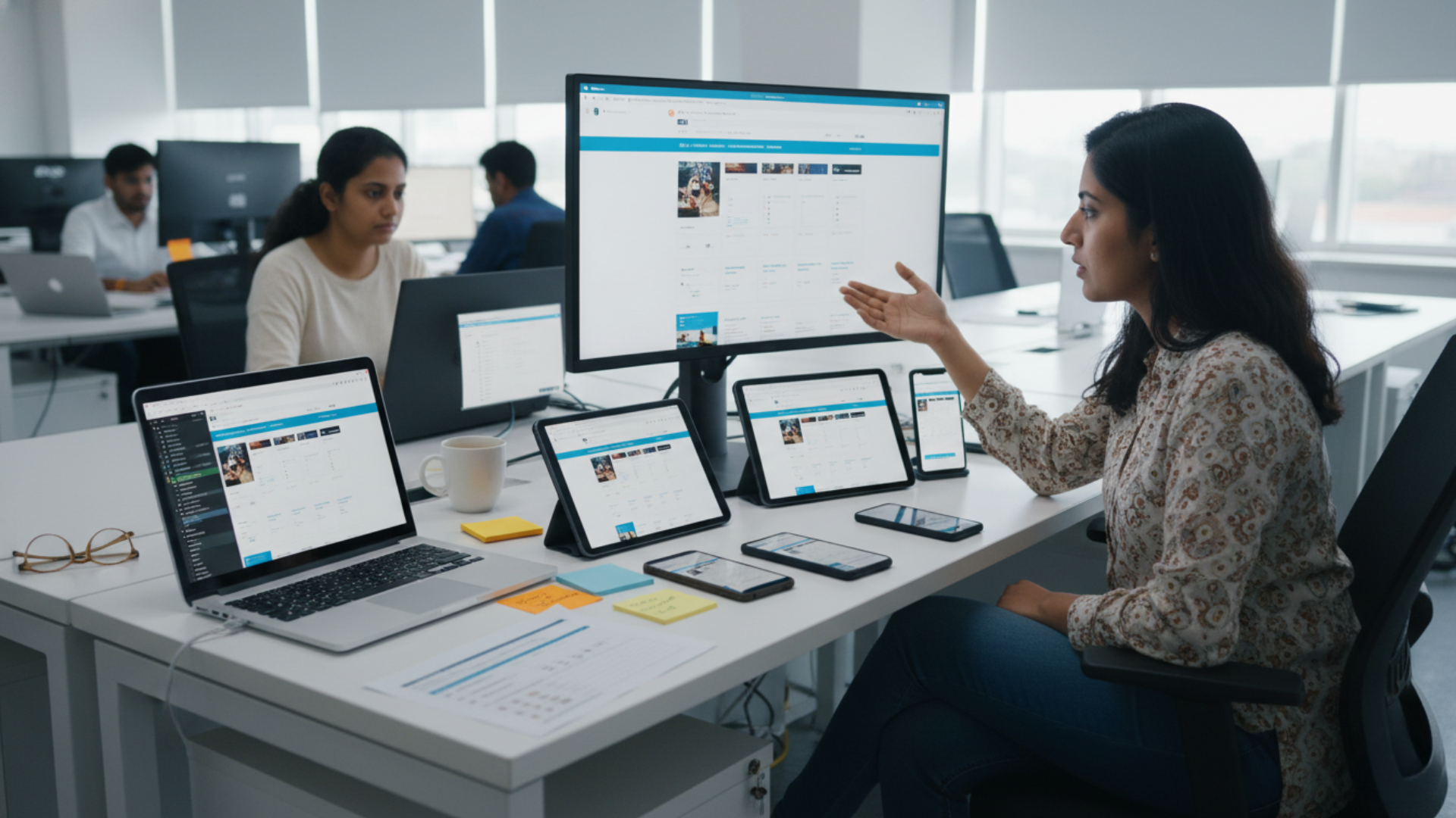
Think of water. If you pour water into a wide cup, it seamlessly takes the shape of the cup. If you pour it into a narrow bottle, it instantly adapts to take the shape of the bottle. Responsive web design works in the exact same fluid manner. It is an intelligent, modern web development approach that uses flexible grids, fluid images, and CSS media queries to automatically adapt your website’s layout based on the specific screen size of the device being used.
Whether a potential customer visits your site from a massive 27-inch desktop monitor in a Hitech City corporate office, an iPad in Gachibowli, or a budget smartphone right here in LB Nagar, the content intelligently rearranges itself. Images resize perfectly without losing quality. Text becomes instantly readable without requiring the user to pinch and zoom. The complex navigation menu seamlessly shifts into a touch-friendly icon.
You do not have multiple clunky websites to maintain; you have one incredibly smart, fluid website that looks and performs perfectly everywhere. Working with a top-tier responsive web design company in Hyderabad ensures that this fluidity keeps your brand image highly professional no matter how it is accessed by consumers.
2. Google’s Mobile-First Indexing: The SEO Game Changer
This is arguably the most critical technical reason why Google heavily prefers responsive design. A few years ago, Google fundamentally changed its algorithm by shifting to Mobile-First Indexing. In simple terms, this means Google now predominantly uses the mobile version of your website’s content for indexing, ranking, and understanding what your business is about.
It absolutely does not matter if your desktop site is a breathtaking work of art. If your mobile site is slow, hard to navigate, or missing vital content, Google will actively penalize your rankings. Search engines have one primary goal: to provide the best, most frictionless results for their users. Since well over 60% of all global web searches now happen on mobile devices, Google forcefully prioritizes sites that cater specifically to mobile users.
A responsive design sends a very clear, positive signal to Google’s crawling bots. It tells the search engine that your site architecture is modern, meticulously maintained, and profoundly user-friendly. When you hire an expert responsive web design company in Hyderabad to optimize your code, you are directly aligning with Google’s core ranking requirements, placing your business ahead of competitors who refuse to upgrade.
3. Lower Bounce Rates and Skyrocketing Engagement
Imagine a user in Dilsukhnagar searches for your services, clicks on your link, and is greeted by microscopic text that they have to pinch, zoom, and scroll horizontally just to read your phone number. They will get instantly frustrated. Within three seconds, they will hit the “back” button and click on your competitor’s link. In the SEO world, this is called a “bounce.”
A consistently high bounce rate triggers a massive red flag for Google. It tells their algorithm that your landing page is not relevant, helpful, or user-friendly, severely hurting your overall SEO score. Any experienced responsive web design company in Hyderabad will tell you that a fluid, mobile-friendly design elegantly solves this problem.
- Clear Presentation: It presents information clearly and logically, stacking content columns so reading is entirely effortless.
- Touch-Friendly Interfaces: It makes “Call Now” or “Buy” buttons large enough to be easily tapped with a thumb without accidentally clicking the wrong link.
- Increased Dwell Time: When users find your site easy to navigate, they stay significantly longer to explore your company history and service pages.
This increased “dwell time” is an incredibly powerful positive SEO signal. It proves to Google that your website provides genuine value, which directly leads to higher organic rankings and more physical customers walking through your doors.

4. Single URL Structure for Better SEO Authority
Before responsive design became the industry standard, businesses used “m.dot” sites (for example, navigating to m.example.com instead of www.example.com on a phone). This outdated practice effectively created two entirely separate versions of the exact same content.
This approach was an absolute nightmare for SEO. It frequently confused Google’s indexing algorithms. It split your inbound traffic in half. Most destructively, it diluted the “link juice” (the domain authority passed from external sites linking to you) because some websites would link to the desktop URL while others linked to the mobile URL. It essentially required business owners to fund and manage two completely separate SEO campaigns.
With a responsive design, you have one single, powerful URL. All of your valuable backlinks point to one consolidated domain. According to leading SEO authorities like Moz, this makes it exponentially easier for Google bots to crawl, index, and organize your site architecture. Partnering with a skilled responsive web design company in Hyderabad ensures that duplicate content penalties are eradicated and your page authority is heavily consolidated.
5. Why Choose Our Responsive Web Design Company in Hyderabad?
We are not just a group of freelance coders. We are dedicated, strategic growth partners for businesses in LB Nagar, Gachibowli, and the surrounding areas of Telangana. Here is why local businesses trust Digital Natives to be their preferred responsive web design company in Hyderabad:
- User-Centric Philosophy: We design meticulously with the end-user in mind. We understand exactly how people in Hyderabad interact with their smartphones. We strategically place action buttons right where thumbs naturally rest and utilize high-contrast typography for maximum readability.
- Future-Proof Technology: Because our code relies on fluid percentage-based grids rather than fixed pixels, we build resilient websites that will naturally adapt and still look phenomenal on the unknown devices of tomorrow.
- Local Trust & Reliability: We are physically located right here in LB Nagar. You can walk into our office, shake our hands, and discuss your vision. We are not a faceless, overseas agency. We build long-term relationships firmly rooted in transparency.
- Obsessive Testing: Before your website ever goes live, we painstakingly check its performance across a massive matrix of physical devices, testing on iPhones, Androids, and tablets.
6. Frequently Asked Questions (FAQs)
Why is hiring a responsive web design company in Hyderabad better than building a separate mobile site?
Will a responsive website immediately improve my local SEO rankings?
Can a responsive web design company in Hyderabad convert my old desktop site?
Does responsive web design affect website loading speed?
Conclusion
The internet is no longer sitting quietly on a desk in a home office. It is constantly in our pockets. It is in the palm of our hands. It travels with us everywhere we go. If your business website is stubbornly stuck in the rigid, desktop-only era, you are completely invisible to a massive, highly profitable portion of your target audience. Responsive web design is no longer a luxury option or an expensive add-on. It is the absolute, non-negotiable industry standard.
Google demands it. Your fast-paced customers expect it. And your business desperately needs it to scale a
nd grow in the modern economy. Do not let an outdated, rigid design break your business reputation and cost you sales. By choosing the right responsive web design company in Hyderabad, you can build a powerful digital asset that perfectly fits every single screen and captures every single opportunity.
Ready to Dominate Google with a Mobile-First Website?
Stop losing valuable customers to competitors with better websites. Partner with Digital Natives, the most trusted responsive web design company in Hyderabad, and watch your online traffic skyrocket. Contact us today!
- 📍 Location: LB Nagar, Hyderabad, Telangana
- 📞 Phone: +91 9052666707
- ✉️ Email: info@digitalnatives.co.in